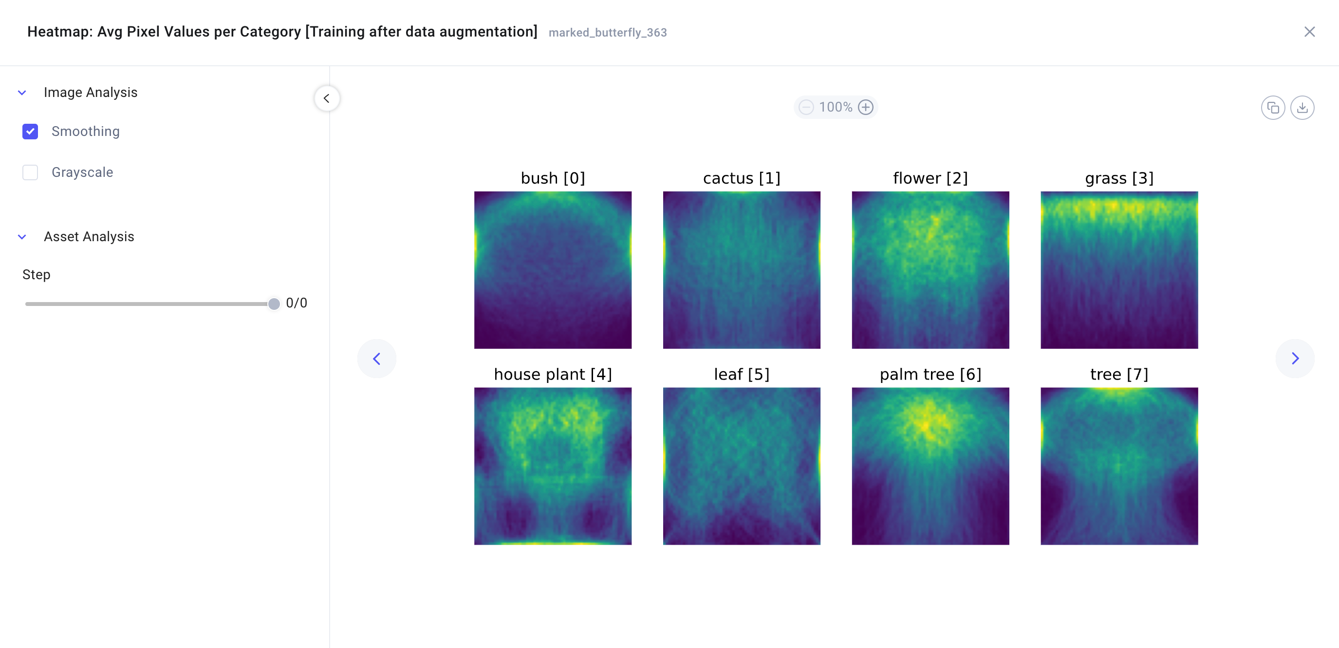
Log curves and plots
Comet allows you to log curves and plots to the Comet platform for visual analysis of an experiment's attributes and performance.
You can use log_curve() to log curves as x and y vectors that can be plotted against one another, or directly log plots created with Seaborn, Plotly and Matplotlib figures using the log_figure() method. You can visualize logged curves and plots in the Single Experiment page and in panels.
The following methods can be used to log plots and curves:
- For plots:
log_figure(). - For curves:
log_curve().
The following panels can be used to visualize plots and curves:
- For curves: Logged Curve.
- For plots: Image Panel.
In addition you can view plots and curves in the following Single Experiment page tabs:
- For the first 25 curves: Panels Tab.
- For plots: Graphics Tab.
- For curves and plots: Assets & Artifacts Tab:
curvesandimagesfolder respectively.
For example, you could...
Plot the feature importances to examine the relative importance of features and identify which ones have the most significant impact on model predictions.
Log a curve
The example below logs a precision-recall curve from precision and recall metrics calculated with the sklearn.metrics.precision_recall_curve() method on 4 mock true and predicted labels.
1 2 3 4 5 6 7 8 9 10 11 12 13 14 15 16 17 18 19 20 | |
Additionally, you could use the overwrite argument to overwrite any existing asset with the same name.
Tip
We recommend logging the same curve over multiple steps to better understand how your model is performing as it's training.
Log a figure
The examples below showcases how to log example figures created with Matplotlib, Plotly, and Seaborn.
1 2 3 4 5 6 7 8 9 10 11 12 13 14 15 16 17 18 19 20 21 22 | |
1 2 3 4 5 6 7 8 9 10 11 12 13 | |
Note that you are required to save the figure as .html, otherwise you will get an error indicating missing dependencies.
1 2 3 4 5 6 7 8 9 10 11 12 13 | |
Additionally, you could add the figure_name argument to provide a descriptive name for the figure, use the overwrite argument to overwrite any existing asset with the same name, or pass the step argument to associate the figure to a training step.