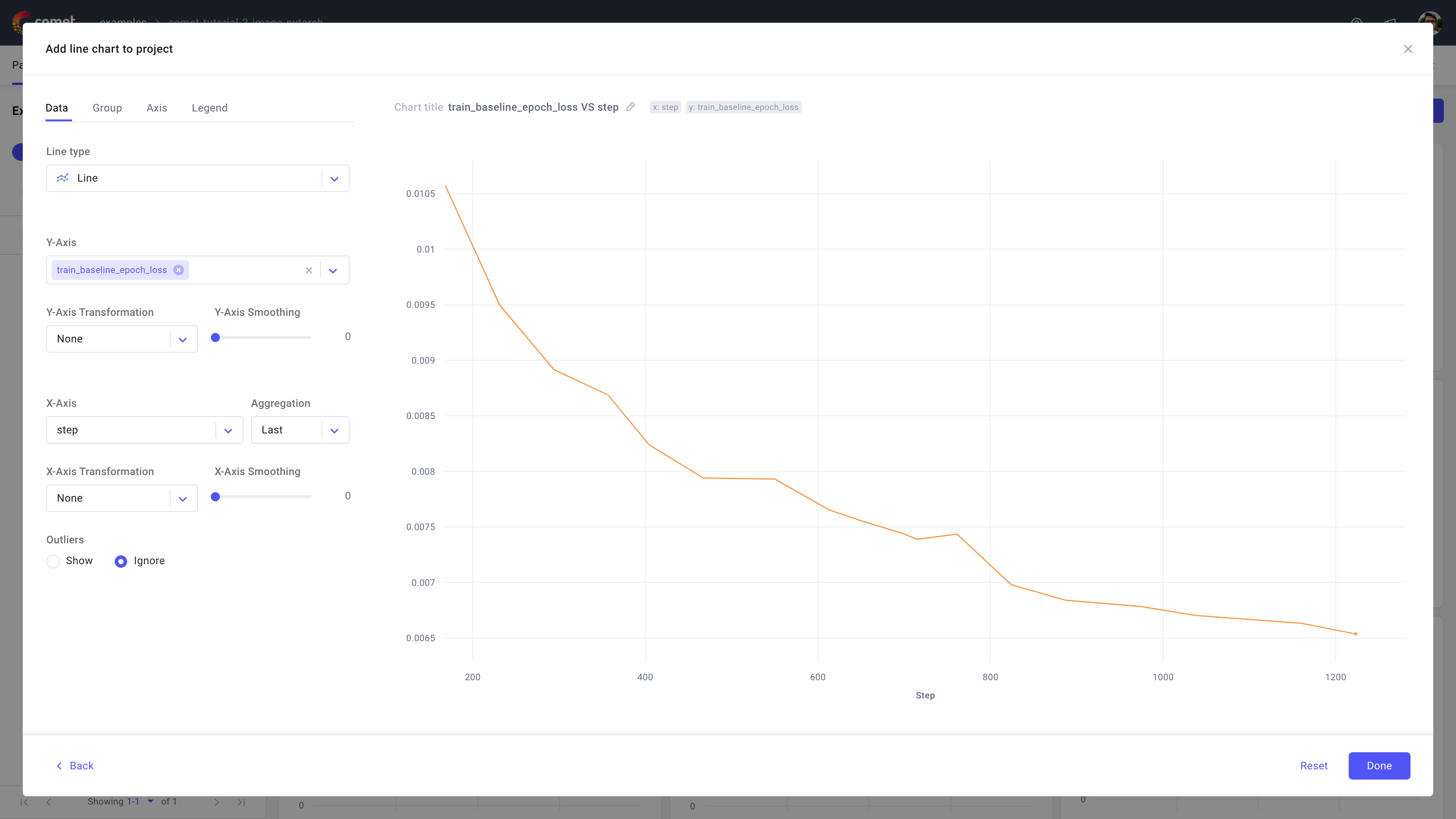
Line chart
A line chart connects data points with straight lines in order to illustrate trends or changes in continuous data series.
Use the line chart in Comet to visualize a metric against another metric of interest, typically time (duration, wall time, or step).
About the Configuration Sidebar
The Configuration sidebar consists of four tabs:
Data: Select what to display in each axis and the type of line chart to create.
Line type: Choose the type of line chart bar to plot between line, area, stacked, or normalized stacked.
[Y-Axis, X-Axis]: Define the experiment attribute to use for each axis, including which transformations to perform on it and how much smoothing to apply as a percentage in [0, 1].
For the Y-axis, you can choose more than one field and each field will be displayed in its own line.
For the X-axis, you can define an aggregation between: count, sum, avg, median, mode, rms, stddev, Min value, Max value, first, and last [default is last].
Supported transformations for both axes are: None, log scale, log_e, log_10, and moving average [default is None].
Outliers: Decide whether to show or ignore outliers.
Group: Decide whether to group the selected fields for the Y-axis by a supported experiment variable.
Given the selected group by variable, the Grouping aggregation selector will display supported aggregations (such as mean, min, max, etc.).
Also, you can optionally select a range between Min/Max and Std Dev.
Note
All selected Y-axis fields will undergo the same group-by.
Axis: Define min and max value for either or both X and Y axis.
Legend: Decide whether or not to display up to 3 legend keys in the chart.
The selected legend keys are appended in order and separated via a "-".
By default, the panel does not display the legend and suggests using the experiment name only.
About the Panel Preview
The panel allows you to interactively analyze the lines at each X-axis step.
When hovering on any (imaginary) vertical line rooted at an X-axis step, the panel displays the dotted vertical line and the Y-axis value for each line.